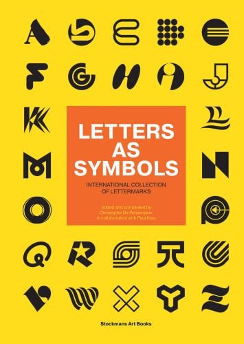
Letters as Symbols
International Collection of Lettermarks
- The book is not only a celebration of letters as symbols, it is also a celebration of the skill and knowledge that goes into logo design
- It is clear that Paul Ibou has had an impressive artistic career of more than half a century. He rightly describes himself as a 'total multi-artist'. Probably because that sounds better than 'constructivist image builder, graphic and plastic designer, designer, typewriter and typographer, writer, publicist, publisher and specialist in visual communication', which he was
- The logos featured in Letters As Symbols are a combination of work made by the greatest of all time and of work by contemporary known and unknown designers or agencies
Paul Ibou designed during his career more than 350 logos & symbols and is one of the important pioneers in modern graphic design. Next to his design activities he published numerous books on symbols and logo’s. In 1991 he built the foundations of the book Letters As Symbols: the concept, the cover and the basic layout. The book was never released and remained untouched for decades until young graphic designer Christophe De Pelsemaker and Paul Ibou established a collaboration in 2017. Paul Ibou acquired an enormous amount of logos through submission forms that were sent to him by the leading logo and brand identity designers of that time like Saul Bass, Burton Kramer, Anton Stankowski, Yasaburo Kuwayama, Ken Cato, Wim Crouwel and many more. Letters As Symbols, contains logos from these submissions and was completed with contemporary work. Each logo is based on a letter of the Latin alphabet (A-Z) and forms an excellent source of inspiration for designers, artists, agencies, teachers, typographers, students, and many others.
- Publisher
- HOPPER&FUCHS
- ISBN
- 9789077207642
- Published
- 5th Mar 2025
- Binding
- Hardback
- Territory
- World excluding France and Benelux
- Size
- 300 mm x 210 mm
- Pages
- 320 Pages
- Illustrations
- 309 b&w
Distributed by ACC Art Books
Our Catalogues
Please log-in or create an account to see your recent items.